
Graphite
Black on light gray, white cards with big corners and pill buttons. Made for finance and dashboards.
Documentation
How to change the look of one piece or of a whole screen.
A pack is a family of widgets that match: each one has its own version of 39 widgets, and it changes the shape of the pieces, not only the color. Apply it to one widget, or to the whole page from the Variants tab. It can follow the project's accent color.
Black on light gray, white cards with big corners and pill buttons. Made for finance and dashboards.
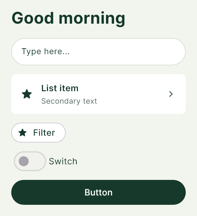
Forest green and sage, pill fields and tags with a thin border. Calm, for health or natural products.

Ember red to orange with light pill controls. Energetic, for modern finance.

A bright green, with black pill buttons and almost white fields. For banking and clean apps.

Silver grays, small corners and headlines in a monospaced font. For technical tools.

Warm, soft tones, pill fields and tags. For care, health and services.
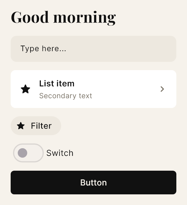
Serif headlines on cream, and a black button with soft corners. For fashion and content.

Black and electric lime, with a lime button with black text. For mobility and energy.
Google Fonts typefaces, six weights, italic, underline, strikethrough and alignment. Also two-tone text: paint the decimals of a price, the first word or the last one in another color.
A color picker by hue, saturation and brightness, or by hex code. Gradients on backgrounds and buttons, opacity, rounded corners and three kinds of shadow: the usual one, a hard one and a color glow.
A border with a rotating gradient, a pulsing glow or a spark that runs along the outline. And a glass effect: frames, cards, bars, buttons and fields blur what is behind them over a semi-transparent background.
Make a widget react when it is tapped, when it appears or when the mouse passes over: its opacity, size, rotation or position change, quick, smooth or with a bounce. You see it in the preview.
More than 6,600 Material icons in three styles and 64 color logos of payments, crypto, flags and social networks. And you upload your own photos from your computer (up to 8 MB each).
Bar, horizontal bar, line, area, pie, donut and radar charts, with up to three series and a tap that highlights. Month and week calendars, a date picker and a month with dots.
The accent color and the base colors of the project are set once, and the style packs can follow them.