
Text
A piece of text, from a small label to a headline.
You can change: The text, size, color, alignment, font, weight, italic, underline and strikethrough. It can also be two-tone: the decimals, the first word or the last one in another color.
Documentation
The pieces a screen is built from: what each one does and what can be changed on it.
A piece of text, from a small label to a headline.
You can change: The text, size, color, alignment, font, weight, italic, underline and strikethrough. It can also be two-tone: the decimals, the first word or the last one in another color.
A button that does something when tapped: go to another page, go back, open a bottom sheet or open a web link.
You can change: The text, background color, corners, icon (at the start, at the end or apart) and what it does.

A single icon, from a library of more than 6,600 Material icons, or a color logo (payments, crypto, flags and social networks).
You can change: The icon, size and color.
A photo or picture. You upload your own from your computer (up to 8 MB).
You can change: The photo and how it fits its space (cover, contain or stretch).

A round button with just an icon: back, search, share.
You can change: The icon, the background color and the icon color.

A line that separates parts of the screen, with an optional text in the middle ("or", "or continue with").
You can change: The color, thickness and text.

A small tag for a status, a counter or something new.
You can change: The text, colors and corners.

Material's floating action button, the main action of a screen.
You can change: The icon and the colors.

An icon that switches between two states when tapped: favorite, saved, like.
You can change: Whether it starts on, the icon of each state and the colors.

A field to type in. In the preview you really type.
You can change: The hint text and the field's style.

A dropdown menu to pick one option from a list.
You can change: The options, the chosen option, background color, border and corners.

A box to check, with its text.
You can change: The text and whether it is checked.
A radio button: one among several.
You can change: The text, whether it is selected and the color.
An on/off switch with its text. In the preview it turns on and off.
You can change: The text and whether it is on.

A slider to pick a value between a minimum and a maximum.
You can change: The value, minimum, maximum, color and whether the number is shown.
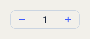
A counter with minus and plus buttons, like a product quantity.
You can change: The value, minimum, maximum, step and color.
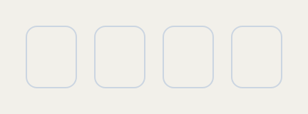
A code or PIN field, with one box per digit.
You can change: The number of digits, whether they are hidden and the color.

A calendar. Four styles: month, week, date picker and month with dots.
You can change: The style, color, whether the week starts on Monday, the navigation, the "today" button and the marked days.

A row of colors to pick one, as circles or squares.
You can change: The colors, which one is chosen, the shape, size, spacing and ring.
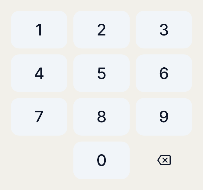
A numeric keypad, for amounts or codes. In the preview it types into a field.
You can change: The key style, the bottom-left key, the letters, the maximum length and the colors.
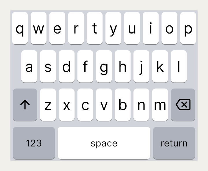
An on-screen keyboard, iOS or Android, light or dark, to design the moment of typing. It types into the field you choose.
You can change: The platform, whether it is dark, the layout, the texts of the space and return keys, and whether it sticks to the bottom.

A list row: title, description, an icon at the start and something at the end.
You can change: The title, description, the leading icon, what goes at the end and the colors.

A card that groups other widgets on a background with corners and a shadow.
You can change: The color, corners, shadow and border.

A person or a brand in a circle or square: photo, initials or icon.
You can change: The type, initials, icon, shape, size and colors.
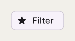
A tag to choose, filter or mark. In the preview it can be selected.
You can change: The text, whether it is chosen, the type, the icon, the close button and the colors of each state.
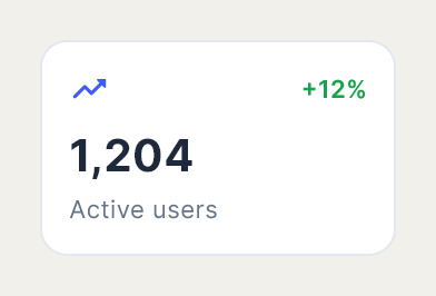
A highlighted number with its name and its change, for a dashboard.
You can change: The icon, value, name, change and colors.

A credit or debit card that flips when tapped to show the CVV on the back.
You can change: The style, color or gradient, brand, bank, number (masked or not), holder, expiry, CVV, chip, contactless mark and whether it flips.
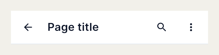
The top bar of a screen, with a title, a leading icon and actions. It stays fixed at the top of the frame.
You can change: The title, the variant, how it behaves on scroll, the icons, whether the title is centered, the colors, border and shadow.

The bottom navigation bar, with tabs. On a tablet it can become a side rail and on desktop a drawer, with adaptive mode.
You can change: The tabs, the selected one, adaptive mode, the colors, the labels, the shadow and the border.

Tabs that switch the content below them. Each tab has its own content.
You can change: The tabs, the selected one, the variant, the colors, whether they scroll and where the bar sits.
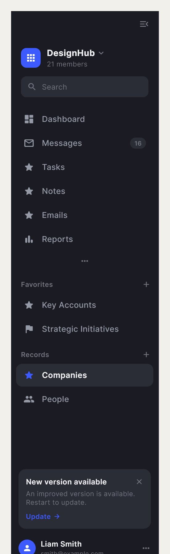
A side navigation menu, open or collapsed, with a search box, a notice and a footer with the name and email of the person.
You can change: The items, the selected one, whether it is open, whether it is dark, the title, the search, the notice, the footer and the colors.

A bottom sheet that slides over the page. A page has at most one. It opens from a button.
You can change: The color, corners, handle, dimmed background, shadow and size.

A chart: bars, horizontal bars, lines, area, pie, donut or radar, with up to three series.
You can change: The type, labels, values, series names, colors, grid, legend, curves and the center text.

A progress bar, also in segments or indeterminate.
You can change: The value, style, label, colors, height, corners and segments.

A circular progress indicator, with a number in the middle if you want.
You can change: The value, style, whether it is indeterminate, the color, the thickness and the label.

An animated loading indicator, for waits.
You can change: The style, the color and the container.

A star rating, with the number of reviews beside it.
You can change: The value, the number of stars, the color, the number of reviews and the size.
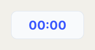
A timer that counts time, for example for a code that expires.
You can change: The mode, the duration, whether it starts by itself, the label and the color.
Puts its widgets one below the other. It is the base of almost every screen.
You can change: The space between widgets, the alignment, padding, size and background.

Puts its widgets one on top of the other, each at the position you give it.
You can change: The size, padding and background; each widget's position is changed by dragging it.

A row that wraps to the next line when it runs out of room: tags, filters, photos.
You can change: The space between widgets, the space between lines, the alignment and the size.
Pages that slide one by one, like a slideshow or an onboarding.
You can change: The page shown, the dot indicator and its colors.

A carousel of cards that slides, with the next one peeking in.
You can change: The page, how much of the next one shows, the indicator, autoplay and its interval, the axis, the loop and the size effect.

A card with two faces that flips when tapped.
You can change: The flip axis, the speed and whether it flips when tapped.
A stack of cards you swipe through, like a deck.
You can change: Which card is on top; each one's content is built inside.
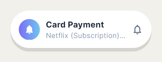
A notification that opens when tapped and shows its detail, with a small chart.
You can change: Whether it is open, whether it opens on tap, the speed, the icon, title, subtitle, amount, date range, total, trend, the values of the chart and the button.
Makes what it holds react when the mouse passes over it: the background, border or size change. For desktop and web.
You can change: The background, the background on hover, the border, the border color on hover and how much it grows.